
Back to top
Making it easier to interpret
analytics reports
Background: Gwella stakeholders have access to data reports that monitor the performance of Gwella hosted webpages they manage, but these go largely unused.
Goal: Identify what's stopping stakeholders from engaging with the dashboards, and redesign them so that users with low digital literacy can confidently read and act on their data.
Solution: Redesign focused on simplified visuals, plain-language explanations, benchmarking, and prioritised key metrics, helping stakeholders quickly understand webpages performance, and make more informed, confident decisions.
Product
- Data Studio Dashboard Reports
Role
- UX Researcher
- UX Designer
- Stakeholder Engagement
Tools
- Google Analytics
- Data Studio
- MS Forms
A note on process: This project ran under tight time constraints, which meant a leaner approach than my other case studies. I've included it because the design challenge (making data interpretable for people with low data literacy) is one I found genuinely interesting, and the constraints shaped some decisions worth reflecting on.
Define: The gap between data and understanding
Conversations with stakeholders revealed that Data Studio dashboards were rarely used, as stakeholders found them difficult to interpret and struggled to use the data to inform their decision-making.
To better understand how stakeholders experienced the existing dashboards, I gathered both informal and structured feedback.
- Informal interviews - I spoke with stakeholders during virtual calls to understand how they used the reports, whether they found them useful, and where they experienced confusion or friction.
- Customer Satisfaction Survey - The stakeholders that utilise the reports completed a survey designed and conducted by my team, to capture feedback on clarity, relevance, confidence in interpreting data, and overall usefulness.
Example of original report for ‘Supervision Hub’
“The report feels like data rather than usable information.”
Stakeholder feedback
Key Insights
- Clarity was the main barrier - Many stakeholders were unfamiliar with data terminology, and jargon made it difficult to translate insights into action.
- Low confidence in interpretation - Even when data was available, stakeholders were unsure what it meant or how to use it.
- Usability issues - Inconsistent structure and poorly designed charts made reports hard to read and navigate.
Prototype: Turning data into clear, actionable insights
I explored new dashboard layouts with a strong focus on clarity and ease of interpretation, treating low digital and data literacy as a core design consideration.
This involved:
- Simplifying visual design - I standardised chart types and reduced visual complexity to make dashboards easier to scan and understand at a glance.
- Adding context and guidance - Each metric was explained in plain-language what it is, how to interpret it, and what question it helps answer.
- Introducing comparisons - I added benchmarks to show how similar webpages were performing, helping stakeholders understand performance in context.
- Prioritising key information - I focused on the most relevant metrics, reducing noise while still allowing deeper exploration where needed.
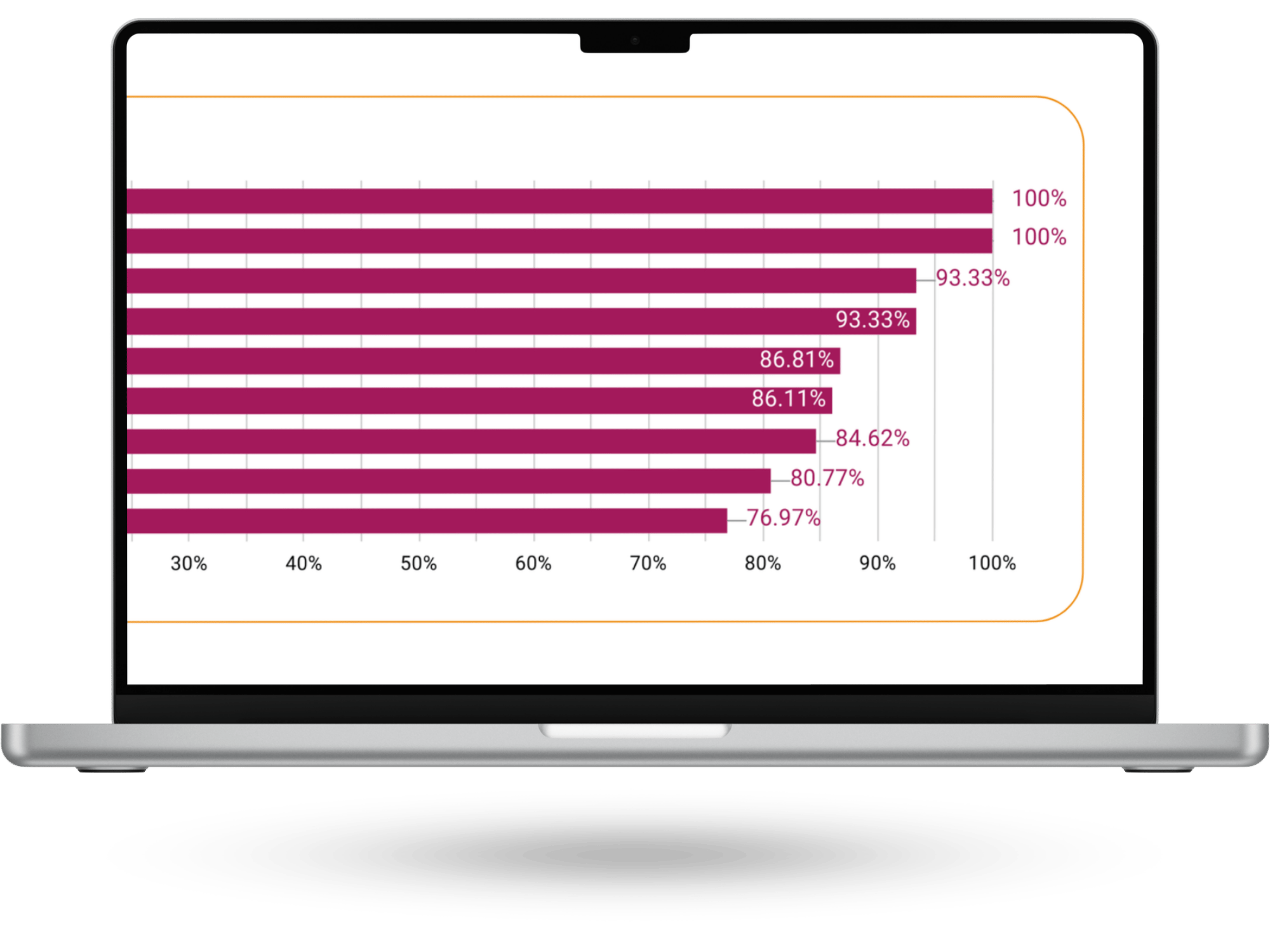
Example of final report for ‘Supervision Hub’
Test: Validating the dashboards with real users
To validate the redesigned dashboards, I gathered informal feedback from stakeholders by sharing the updated reports and discussing their experience using them.
Both stakeholders reported that the dashboards were easier to understand and navigate, and felt more confident interpreting the data. No major pain points were identified. Minor discrepancies in the data were flagged during testing and quickly resolved.
While lightweight, this validation confirmed that the changes improved clarity and usability, and that stakeholders could engage with the data more confidently.
Report as viewed by stakeholder of ‘Supervision Hub’
Outcome
- The new data reports were launched in February 2026.
- Stakeholders have reported acting on the data since the new reports have been launched.
Lessons learned
What worked
- Creating a safe, informal space for stakeholders to share feedback encouraged more open and honest conversations, surfacing frustrations that had previously gone unspoken.
What didn’t go as expected
- Due to time constraints, I wasn’t able to fully follow the full user-centred design process or conduct more in-depth testing. However, I was able to carry out informal validation, which still provided valuable insights.
What I learned
- Designing for data literacy is essential. Clear language, context, and guidance are just as important as the data itself in enabling confident decision-making.
What I’d do differently next time
- I would plan for earlier and more structured testing, involving more stakeholders to validate understanding at each stage and strengthen confidence in the final solution.

Previous case study


Define
Prototype
Test
Back to top
Making it easier to interpret
analytics reports
Background: Gwella stakeholders have access to data reports that monitor the performance of Gwella hosted webpages they manage, but these go largely unused.
Goal: Identify what's stopping stakeholders from engaging with the dashboards, and redesign them so that users with low digital literacy can confidently read and act on their data.
Solution: Redesign focused on simplified visuals, plain-language explanations, benchmarking, and prioritised key metrics, helping stakeholders quickly understand webpages performance, and make more informed, confident decisions.
Product
- Data Studio Dashboard Reports
Role
- UX Researcher
- UX Designer
- Stakeholder Engagement
Tools
- Google Analytics
- Data Studio
- MS Forms
A note on process: This project ran under tight time constraints, which meant a leaner approach than my other case studies. I've included it because the design challenge (making data interpretable for people with low data literacy) is one I found genuinely interesting, and the constraints shaped some decisions worth reflecting on.
Define: The gap between data and understanding
Conversations with stakeholders revealed that Data Studio dashboards were rarely used, as stakeholders found them difficult to interpret and struggled to use the data to inform their decision-making.
To better understand how stakeholders experienced the existing dashboards, I gathered both informal and structured feedback.
- Informal interviews - I spoke with stakeholders during virtual calls to understand how they used the reports, whether they found them useful, and where they experienced confusion or friction.
- Customer Satisfaction Survey - The stakeholders that utilise the reports completed a survey designed and conducted by my team, to capture feedback on clarity, relevance, confidence in interpreting data, and overall usefulness.
Example of original report for ‘Supervision Hub’
“The report feels like data rather than usable information.”
Stakeholder feedback
Key Insights
- Clarity was the main barrier - Many stakeholders were unfamiliar with data terminology, and jargon made it difficult to translate insights into action.
- Low confidence in interpretation - Even when data was available, stakeholders were unsure what it meant or how to use it.
- Usability issues - Inconsistent structure and poorly designed charts made reports hard to read and navigate.
Prototype: Turning data into clear, actionable insights
I explored new dashboard layouts with a strong focus on clarity and ease of interpretation, treating low digital and data literacy as a core design consideration.
This involved:
- Simplifying visual design - I standardised chart types and reduced visual complexity to make dashboards easier to scan and understand at a glance.
- Adding context and guidance - Each metric was explained in plain-language what it is, how to interpret it, and what question it helps answer.
- Introducing comparisons - I added benchmarks to show how similar webpages were performing, helping stakeholders understand performance in context.
- Prioritising key information - I focused on the most relevant metrics, reducing noise while still allowing deeper exploration where needed.
Example of final report for ‘Supervision Hub’
Test: Validating the dashboards with real users
To validate the redesigned dashboards, I gathered informal feedback from stakeholders by sharing the updated reports and discussing their experience using them.
Both stakeholders reported that the dashboards were easier to understand and navigate, and felt more confident interpreting the data. No major pain points were identified. Minor discrepancies in the data were flagged during testing and quickly resolved.
While lightweight, this validation confirmed that the changes improved clarity and usability, and that stakeholders could engage with the data more confidently.
Report as viewed by stakeholder of ‘Supervision Hub’
Outcome
- The new data reports were launched in February 2026.
- Stakeholders have reported acting on the data since the new reports have been launched.
Lessons learned
What worked
- Creating a safe, informal space for stakeholders to share feedback encouraged more open and honest conversations, surfacing frustrations that had previously gone unspoken.
What didn’t go as expected
- Due to time constraints, I wasn’t able to fully follow the full user-centred design process or conduct more in-depth testing. However, I was able to carry out informal validation, which still provided valuable insights.
What I learned
- Designing for data literacy is essential. Clear language, context, and guidance are just as important as the data itself in enabling confident decision-making.
What I’d do differently next time
- I would plan for earlier and more structured testing, involving more stakeholders to validate understanding at each stage and strengthen confidence in the final solution.
Previous case study